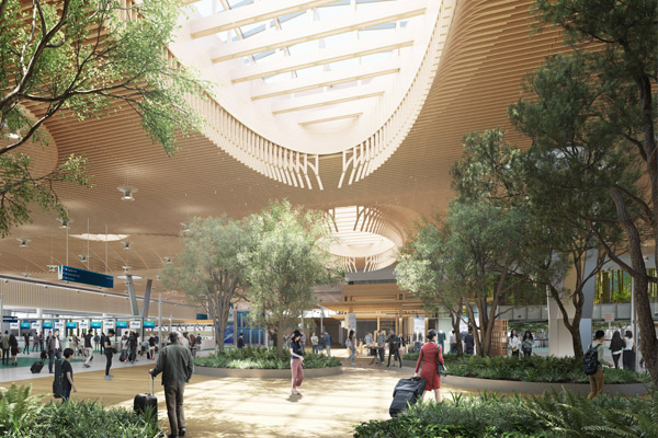
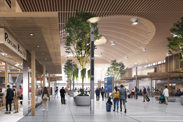
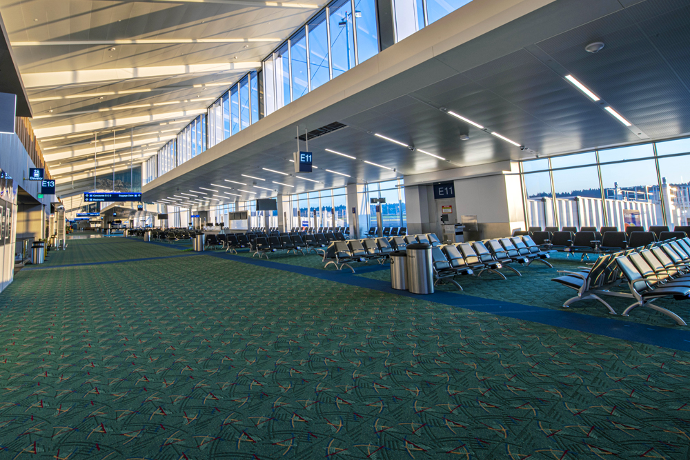
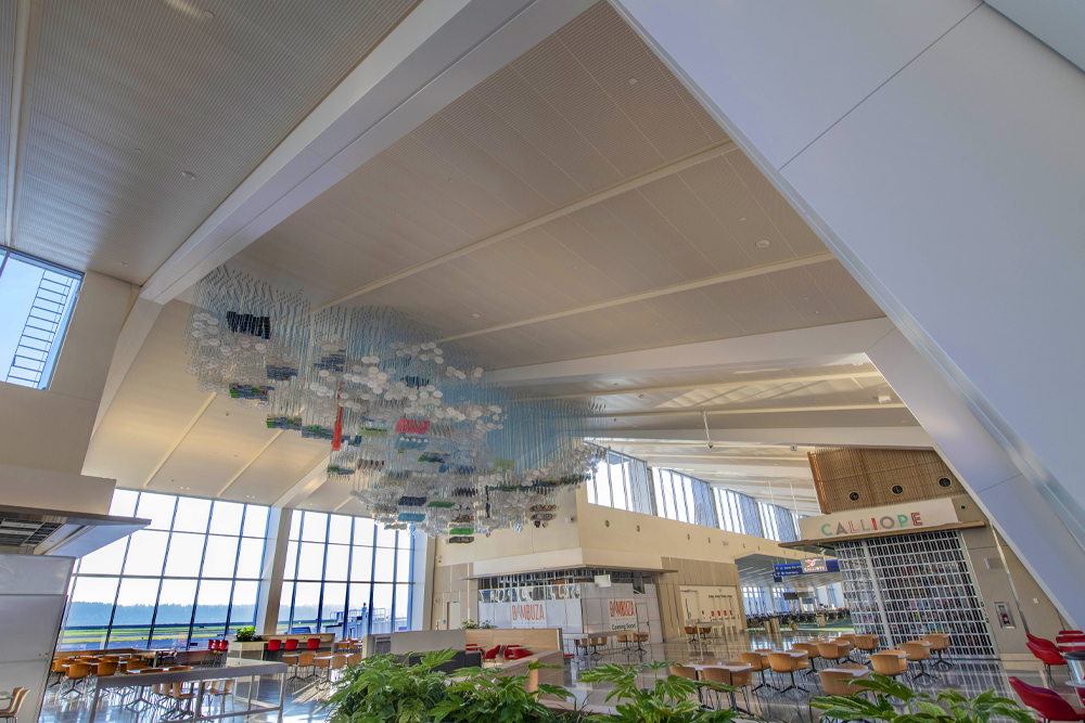
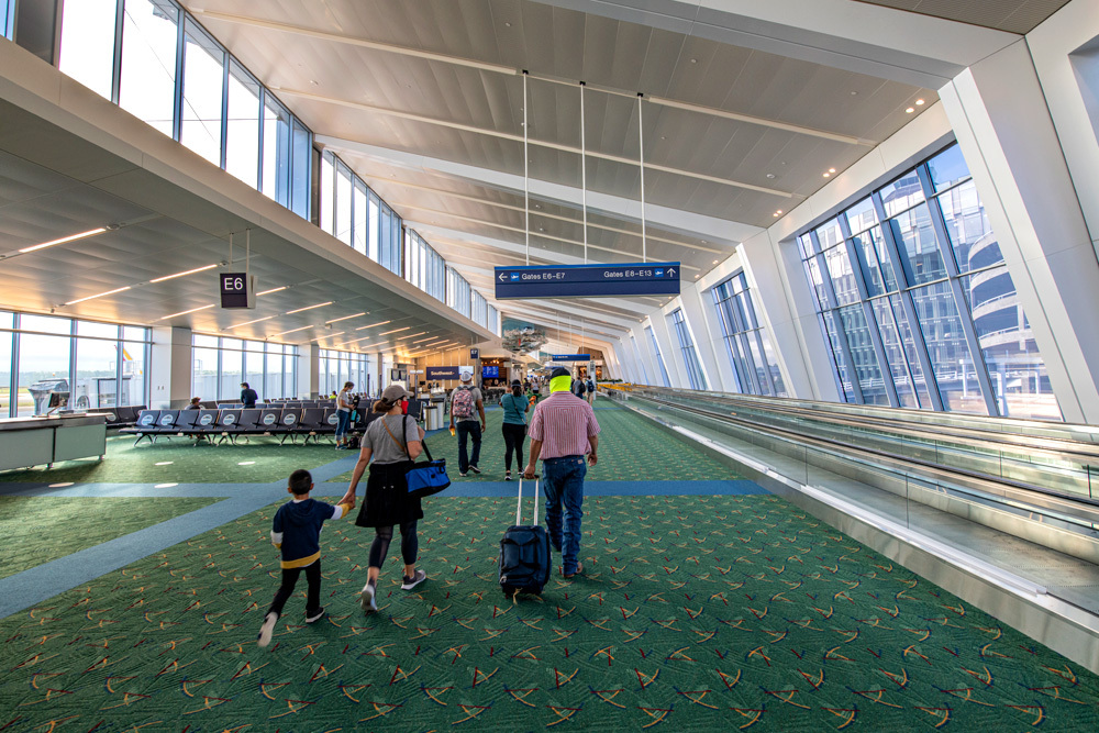
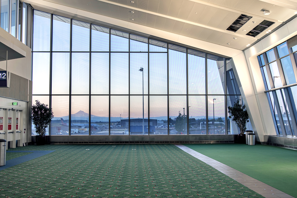
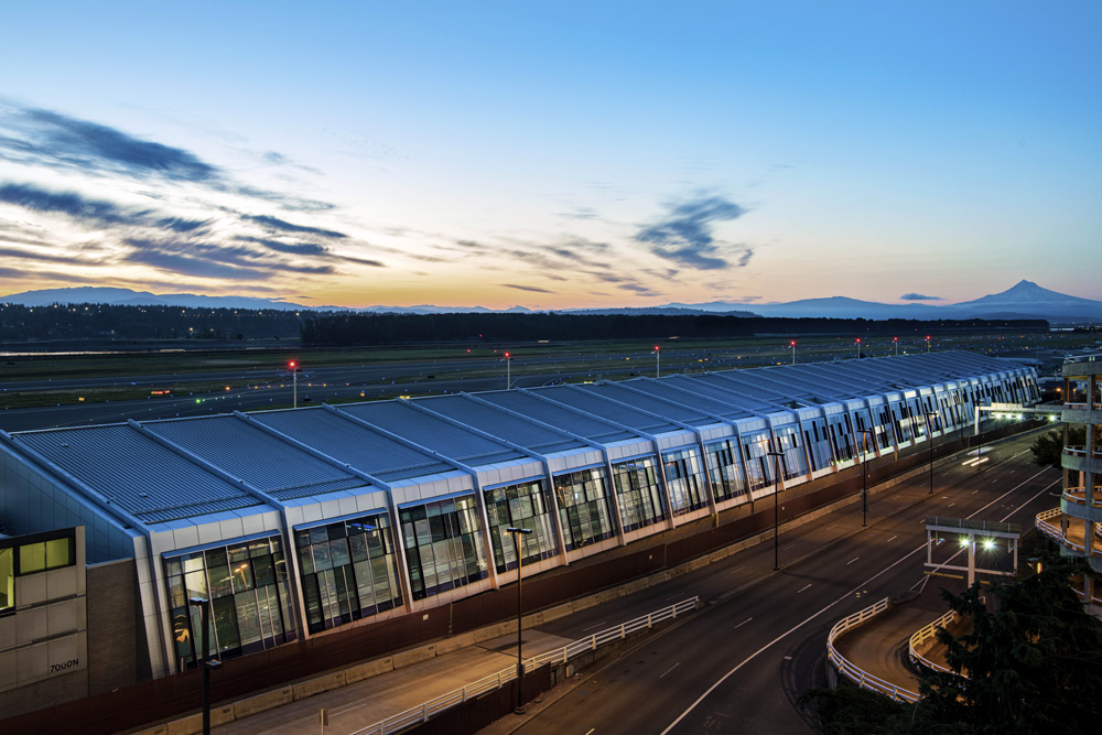
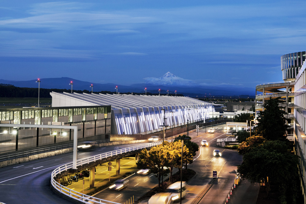
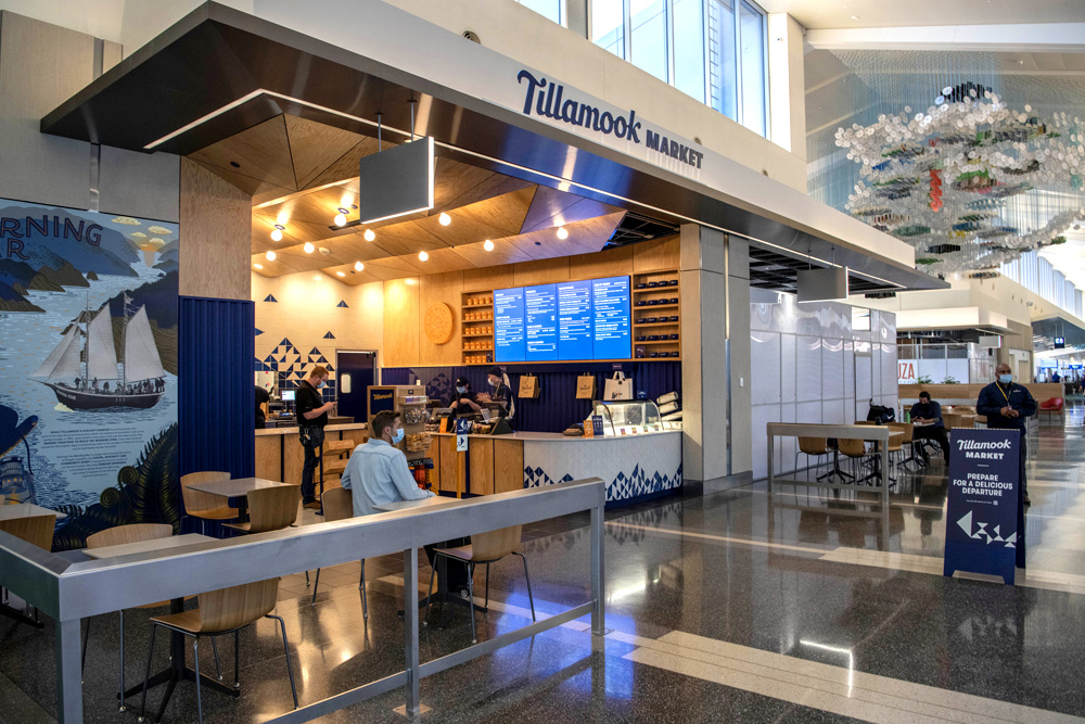
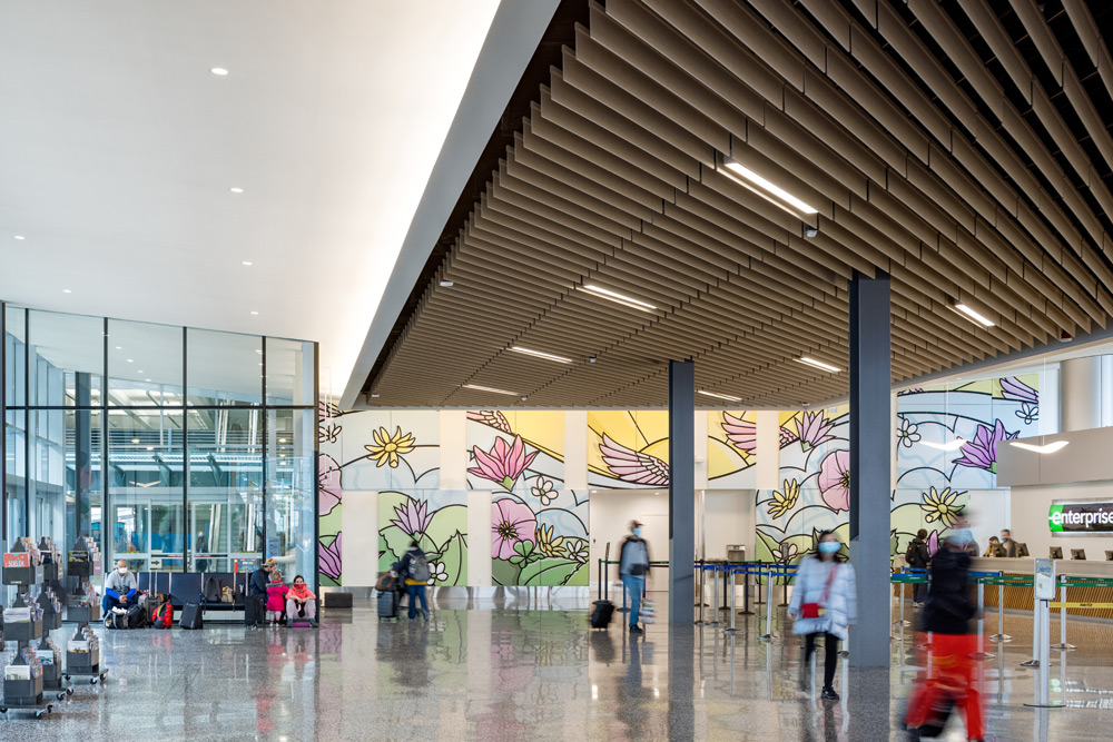
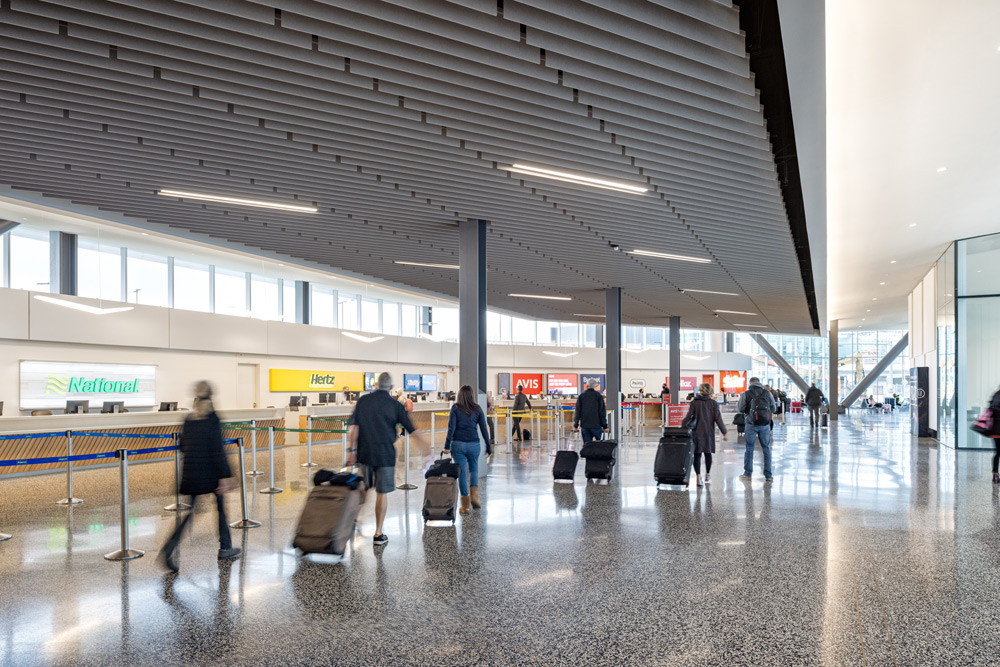
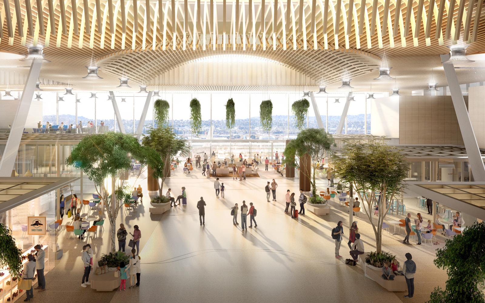
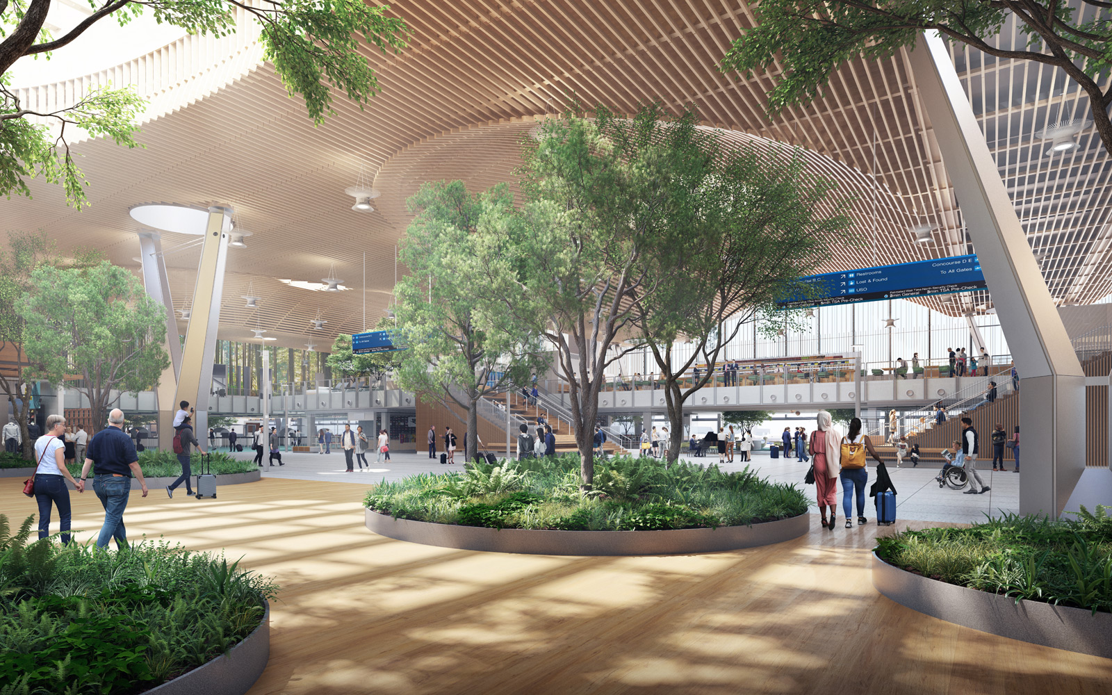
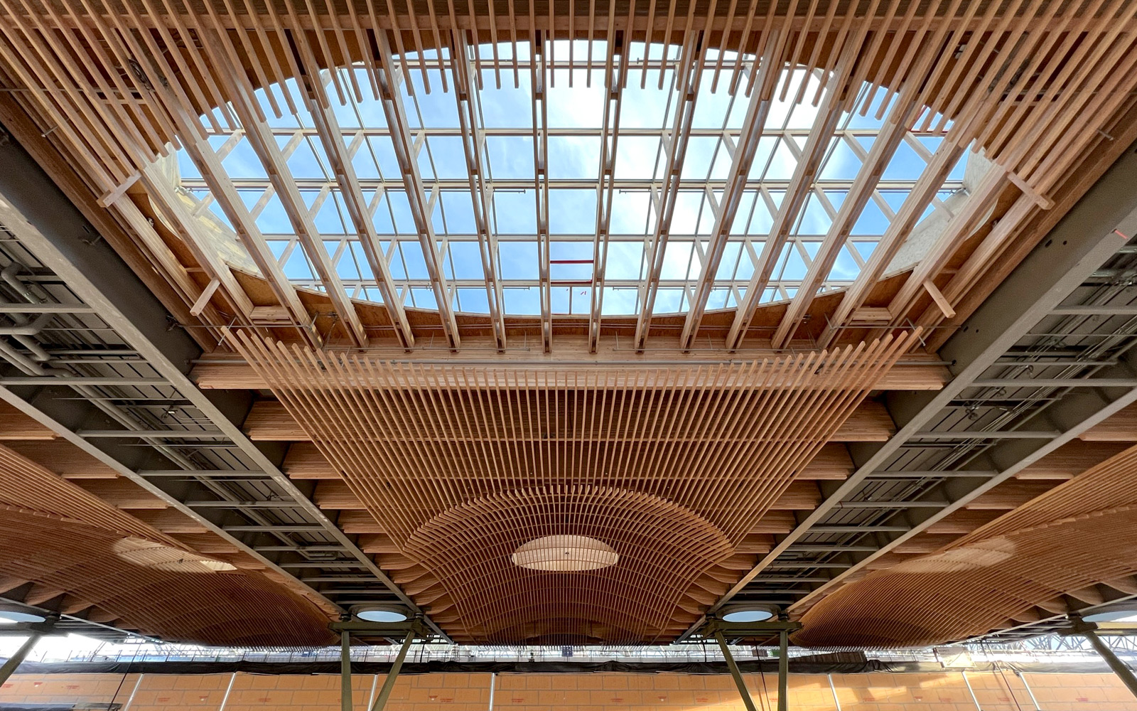
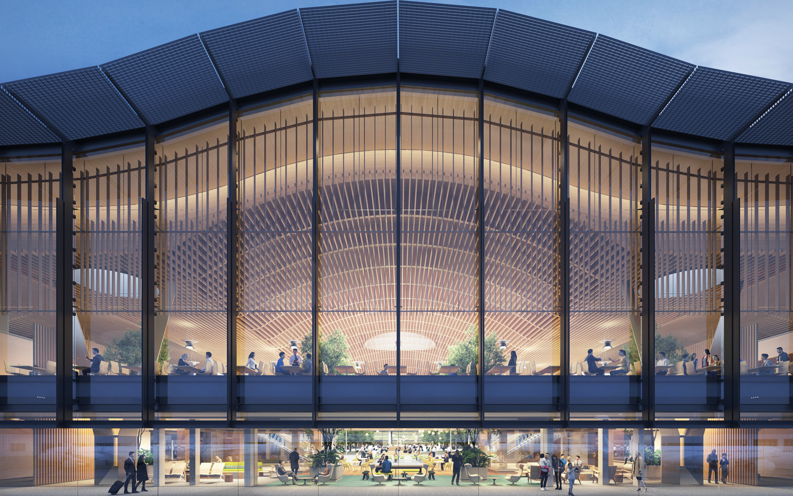
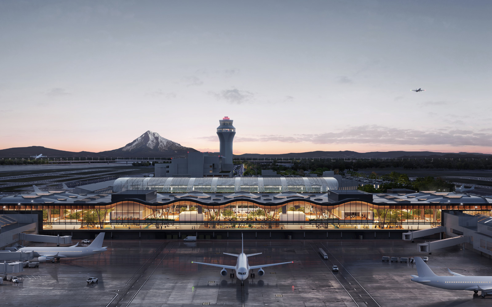
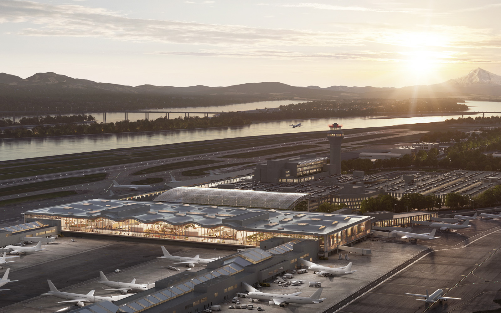
Quick update: The Concourse E expansion opened in 2020. Read more about the new PDX.
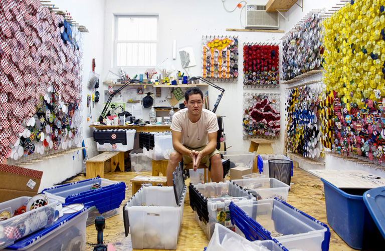
Contemporary artist Jacob Hashimoto has shown his work everywhere from Los Angeles and Chicago to Italy and Finland. But one of his next major installations lands in a less obvious venue: Not a modern art museum but the Portland International Airport.
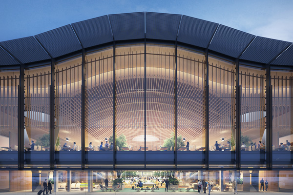
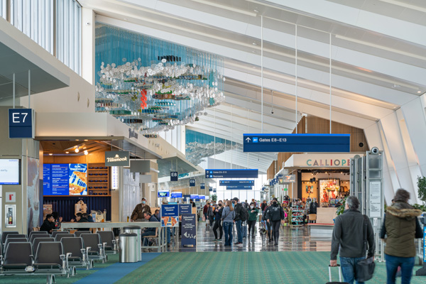
Opening in summer 2020, the new Concourse E extension will double as a gallery for Jacob’s three-dimensional sculptures — canopies of kite-like discs that reflect the atmosphere of the Pacific Northwest and draw inspiration from his Japanese heritage. In a certain sense, this may seem a surprising spot for an internationally acclaimed artist to unveil new work. But the debut of these two large-scale pieces from Jacob, titled “The City” and “The Sky,” is simply the latest iteration of PDX’s long-standing art program, which places Portland among a select group of cities in the United States that have pioneered public art in airports.
The unconventional exhibition space and the broad audience of travelers from all over the world present Jacob with creative challenges. It’s also a homecoming for the New York City-based and Walla Walla, Washington-raised artist. Jacob talks to us about his artistic vision, childhood in the Pacific Northwest and a few graphical clues for PDX fans.
Let’s start with what’s happening next: You have two new sculptural installations coming to Concourse E — what’s the creative concept behind these?
I think that PDX has spent a lot of time crafting itself into the airport that's representative of the values and the culture of the community — more so, really, than most airports I've ever encountered. I wanted to reflect that ethos and sensibility in a subtle way.
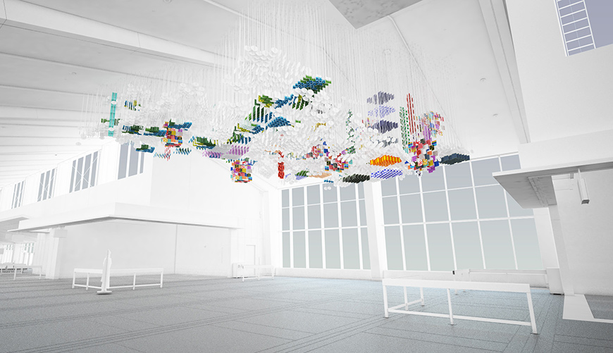
I started by looking at a map. It turns out that the shape of the city limits is a really interesting form; we've taken the outline of Portland and used it as the footprint for both pieces so that if you looked at them from above, they look just like the shape of the city. Both of the suspended sculptures are also built in the same way, using thousands of hanging disks.
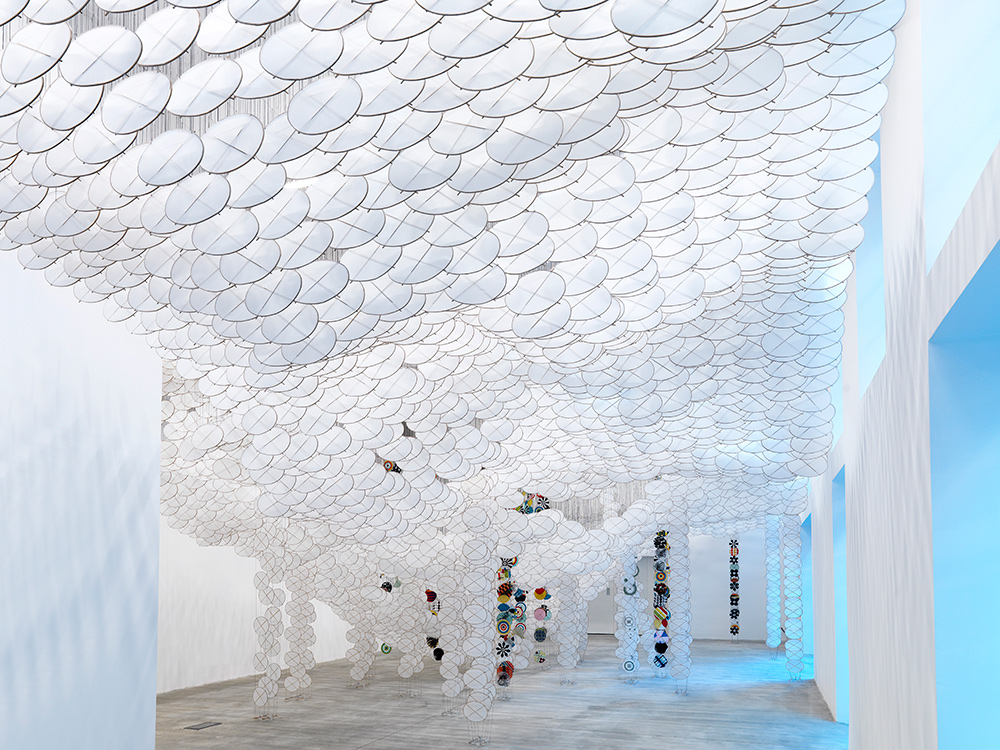
Those are factors unifying both pieces, but each has its own personality. The piece that we're calling “The City” incorporates blocks and graphics forming big chunks of patterns that are representative of distinct neighborhoods. These sections become a floating map of the city featuring local iconography. “The Sky” is about the broader environmental context. It’s this meditative canopy — a soothing, white, diaphanous space where you can just be at peace. Portland is so much about its environment, the mountains, the farms, the access to nature. It’s about capturing that broader narrative of PDX as this gateway to the Pacific Northwest.
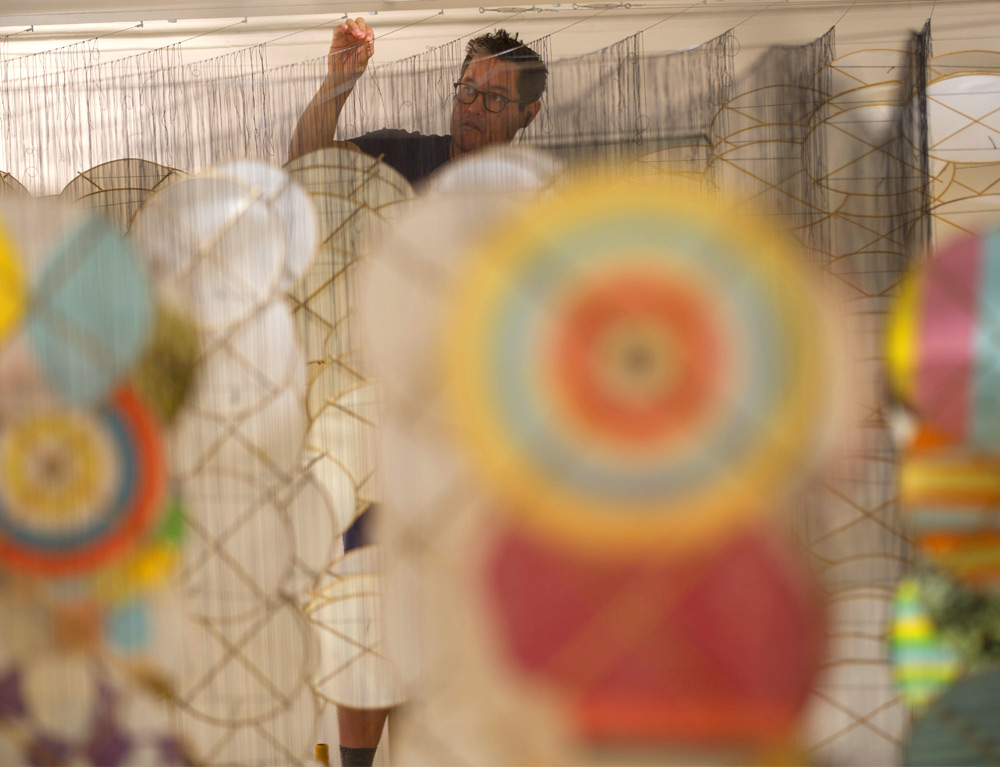
(Credit: Matthew Banderas, Courtesy of Whitman College)
Give us some clues: Are there any graphical or design elements that PDX fans or Pacific Northwest residents will recognize when viewing these works?
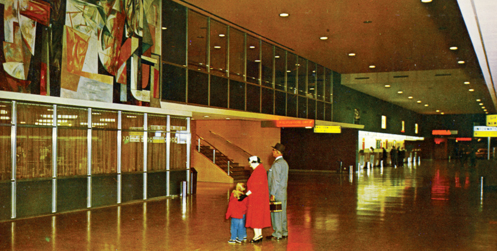
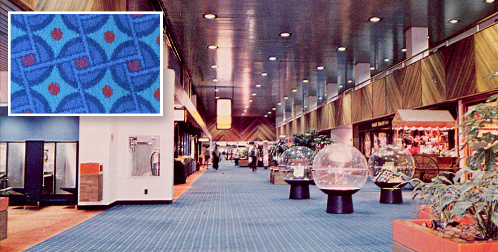
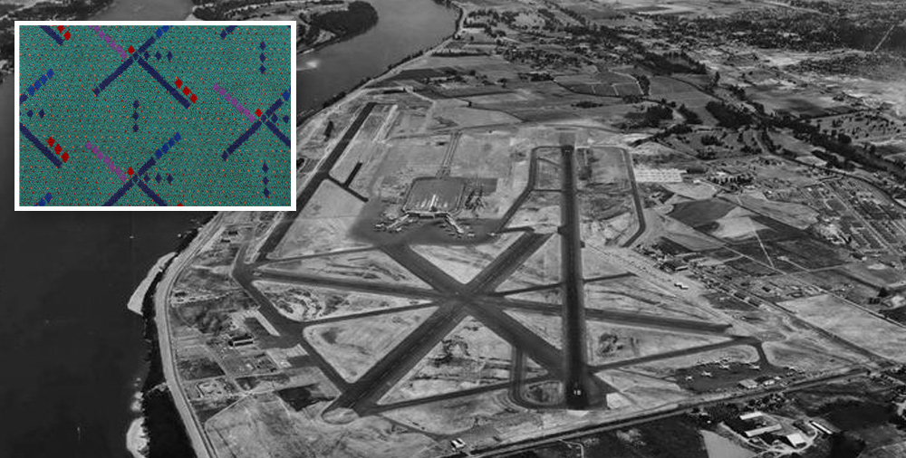
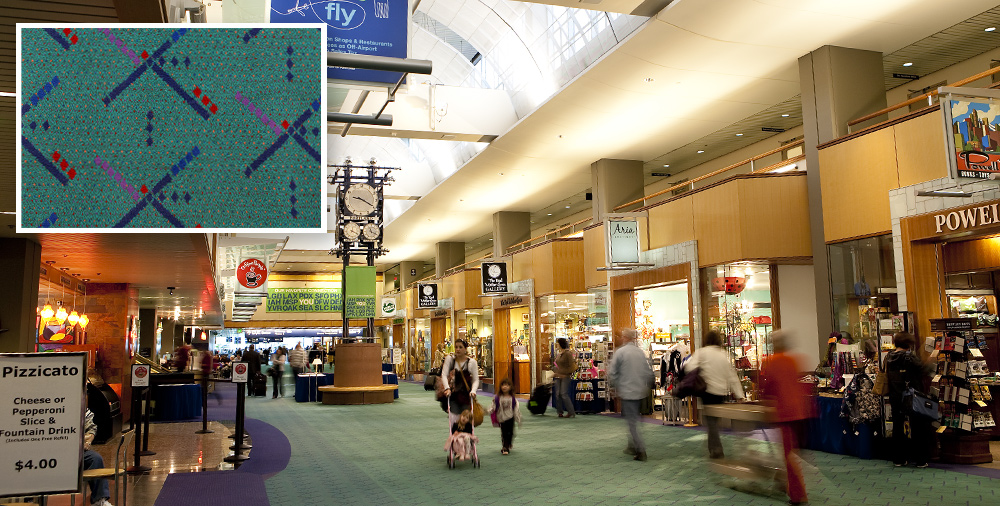
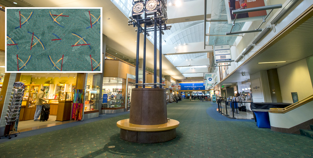
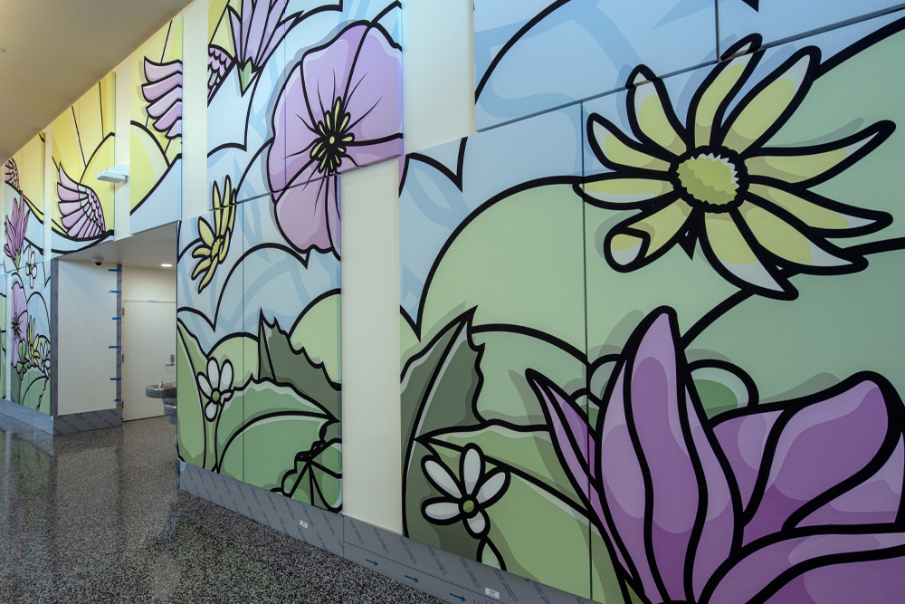
There'll be many details that are readily recognizable. For example, we've taken and played with the city's flag a little. We've built graphics that represent roses and architectural profiles. We have a graphic that represents every bridge in the city, like the Burnside and Hawthorne bridges. We’re also poaching the wonderful designs that PDX has used for the carpet over the years, so there’ll be shout outs to the history of the airport, too.
It'll be interesting to see how people try to decode the meaning in both pieces because there's clearly design language in there that people can recognize. But how it all relates and how all the pieces come together, I think, will be a narrative as diverse as the number of people seeing them. All the parts of the story are there, but how you put them together is completely your business.
What’s your relationship with the urban and natural topography of the Pacific Northwest, and how has that inspired these installations at PDX?
The Pacific Northwest is my aesthetic and creative home even though I've lived in other cities for my adult life. I grew up in Walla Walla, Washington, and for us, Portland was the big city. I remember driving into town and my parents would get really stressed because they're living in a town of 25,000 people and they're like, "There's going to be lots of traffic out there." I remember saving all my money so that I could go record shopping in Portland because we couldn't get anything in Walla Walla.
I left the Pacific Northwest when I was in my 20s. But it's always a place that I go back to, and it’s the foundation of a lot of the work that I do — that sense of hope and possibility and openness. In a lot of the large-scale work I do, like the new pieces at PDX, I’m drawing on that nostalgic vision of the Columbia Valley and the huge skies that you see as you drive up the Gorge. That’s one reason I was so excited about the idea of this project.
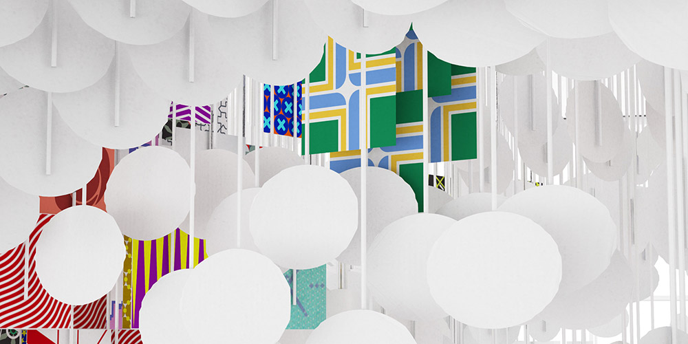
(Credit: Renderings courtesy of Words, Art, Design, Etc.)
Generally in your life as an artist, what are the creative traditions your art draws inspiration from and reacts to?
My work comes out a tradition of American abstraction, with artists like Mark Rothko and Franz Kline. There’s, of course, a lot of art-world verbiage we could use to describe that, but I think part of the reason I was chosen for this PDX project is that my work tends to bridge the art world and pop culture. A lot of people will see things they’re familiar with in the work — references to 8- and 16-bit video games, 3-D modeling, Minecraft and Super Mario Brothers, the stickers you find on the bottom of skateboards. These are just some of the pop-culture references that are woven into my work.
Kites are one of the most fascinating visual motifs in your work. Can you tell us a little about this particular mode of expression?
I’ve worked with them since art school, when I’d build kites to fly in the park across the street from my studio. This element is really important to me personally as a symbol of my childhood and my relationship with my parents. My father used to build kites himself. It’s also this beautiful pan-cultural object that allows people from diverse backgrounds to appreciate my work; 20 years later I'm still using this little object because I can use it in so many different ways to speak to so many different people.
(Credit: Michele Alberto Sereni, Courtesy of Studio la Città)
How does exhibiting work in a transient space such as an airport inspire your design thinking?
The challenge of creating artworks for spaces like airports is that you're not talking to a narrow art-world audience. Your job is to talk to human beings as broadly as possible and to create an experience for a hugely diverse group of people. It's an inclusive audience that's sophisticated in different ways. I think you have to acknowledge that with the work.
But the way I'm dealing with this particular venue is much the way that I've always approached my work where I want to reach a broad audience, but I also want to be able to talk about really interesting things that are relevant to me.
And generally, my work tends to talk about utopian systems; it tends to talk about beauty and higher ideals; it strives to explore those things and keep them as points of aspiration. And I think, especially in today's cultural climate, it’s important to remember that we do have a collective sense of values and purpose that we often don't recognize.
